Typography - putting the right font forward
Why is typography important? There are a number of answers to that question: because it can make (not break) the image you want to portray; putting the right font forward can help readability; using typography properly, like everything else, needs knowledge; the right font in the right place will be noticed and none of it is too difficult if you understand and respect a few basic principles.
Like everything else we notice the things we don't like instantly but we don't always know why - especially with typography. On websites especially most people pick a typeface and stick to it even if other have told them it doesn't really work. I know people like a script face called 'Comic' because they think it is easy to read and friendly. The reality is it can make an unprofessional statement about your company too, especailly if you use it on correspondence.
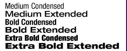
But let's get back to basics. We all know medium, italic and bold - they describe the look of the typeface. We know that a serif faces have little flourishes on the end of the strokes - these are designed to make the typeface easier to read. A sans sefif face has no flourishes and the strokes end in a block. Some families of fonts have 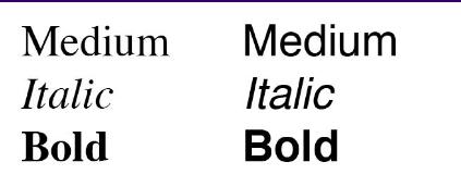 over 20 variations of style. Each typeface has been carefully designed with a use in mind. A condensed face is ideal when you want the height of the statement to be as tall as possible without taking up too much room. The extended faces allow the opposite of that, size width wise without taking up too much height. Of the two options condensed is more readable. Study the widths shown bearing in mind each line is the same height.
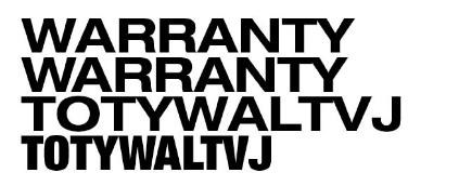
Readability is something many people seem to forget too often. Strange because in the main the readability is exactly what it is all about. While we are on that subject a simple fact - capital letters are not as readable as upper and lower case. Too many people use capitals to draw emphasis to a statement without thinking about what the real message of the promotion is all about. That often brings another problem (also for lower case letters), spacing. See the problems caused by the 'A', 'W', 'T' and 'Y' in the word "WARRANTY". Adjusting the spaces between the letters smoothes out the letter spacing and even makes the word take up a little less width too. Often changing the typeface will reduce the problem, but it won't make it go away.
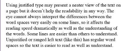
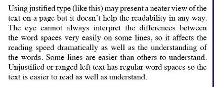
If there is a body of text then the arrangement is crucial if you want the text to be easily read and understood. Magazine and publication designers are aware of this. You'll hardly ever see a body of text centred or ranged right as it renders the readability useless. the more common arrangements are justified and ranged left for ease of readership.
Another interesting point is the width of a column of type, often a disaster on many websites. The rule is for any given size of text is columns should be between six and ten words, if you do not want it to be difficult for your readers to find their way from the end of the line they are on, to the beginning of the next line of text they need.
There are literally thousands of typefaces all with their own character and style. Get to know what is available and select the ones you like. You'll very quickly ensure that as far a typography is concerned you'll be putting the right font forward.
Alan Reading runs Custom Marketing Resources providing a full range of marketing services (especially websites) to clients of all types and sizes. If you haven't gathered already clean typography is one of his pet subjects, like branding. He's good with customer care too so if you know nothing about typography, branding or marketing you no need worry! Free advice on 01622 820841 or creative@cmr-group.co.uk
Alan Reading is an award winning designer, has judged more than his fair share of design awards, hosted breakfasts, lunches, dinners, dinner dances, balls and networking events, compéred fashion shows, radio programmes and appeared on TV more than once, frequently on behalf of clients. He has presented for Business Link, Enterprise Agencies, Chambers of Commerce, at conferences and seminars for The Newspaper Society, the Association of Free Newspapers, The British Hardware Federation, for training and marketing companies on starting, promoting and marketing business.
Alan is a business minded Designer (past President - and Chairman - of 3 Chambers in Kent) running his own business - Custom Marketing Resources (01622 820841) - since 1994. Alan organises The Lenham Valley Business Association www.lenhambusiness.co.uk where he markets and presents the monthly network meetings. He is also chair of the central committee. LVBA has a 50+ page website and a 64 page business directory. South Maidstone Business Association has been running for a while now too - see www.maidstonebusiness association.co.uk
As if he hasn't taken on enough with his community spirit he is now chairman of Maidstone Tourism Association. www.maidstonetourism association.co.uk
You will learn even more about him - and see what his customers say - on his website http://www.cmr-group.co.uk He is willing to provide free advice by phone too - even about websites.
Register with CMR by email today - there's always something new to hear. creative@cmr-group.co.uk
Links to further reading from this article:
Link
Link
Link
Link
Link
Link